SkillFort: Skills & Learning Platform

Project Overview
SkillFort is a modern online learning and skill-acquisition platform designed to solve one of ed-tech's biggest friction points: learner decision fatigue. Traditional course directories overwhelm prospective students with endless walls of unstructured tiles, opaque pricing, and ambiguous time commitments.
As the Lead UI/UX & Product Designer, I owned end-to-end user research, UX architecture, interaction design, visual styling, responsive adaptations, and final frontend implementation to stress-test usability across viewports.
Problem Statement
Online learners seeking in-demand vocational and tech skills encounter three critical hurdles on standard educational landing pages:
Cluttered Course Catalogs
Lack of clear categorization forces learners to scroll through hundreds of irrelevant modules without quick triage filters.
Hidden Commitment Costs
Course cards frequently omit weekly time commitments, prerequisites, and realistic completion rates upfront.
Opaque Pricing Models
Unclear distinctions between pay-per-course vs. recurring subscriptions cause buyer hesitation at checkout.
Design Process
- Define: Outlined the core user journey (Discover → Explore → Evaluate → Enroll) and established fast-triage criteria for course cards.
- Structure: Structured a high-conversion information hierarchy that pairs social proof and curriculum transparency upfront.
- Design: Built interactive Figma components with responsive auto-layout constraints and clear hover/focus states.
- Refine: Tested contrast ratios against WCAG 2.1 AA standards and optimized mobile touch targets (48px minimum).
- Implement: Deployed a live React/Next.js frontend to validate typography rendering, DOM performance, and responsiveness.
Research Methodology
Target Personas & Cognitive Load Reduction
To ground layout choices in real behavioral habits, I mapped two primary archetypes: the Career Switcher (needs clear skill progression & credentials) and the Working Upskiller (needs quick assessment of weekly hours and project deliverables).
Critical Experience Questions
Core UX Interventions
Core UX Breakdown & Design Decisions
Every section of SkillFort was crafted to solve specific learner hesitations, from immediate value communication in the hero section to rapid course discovery, transparent pricing, and structured learning pathways.
High-Impact Hero Section & Practical Value Promise
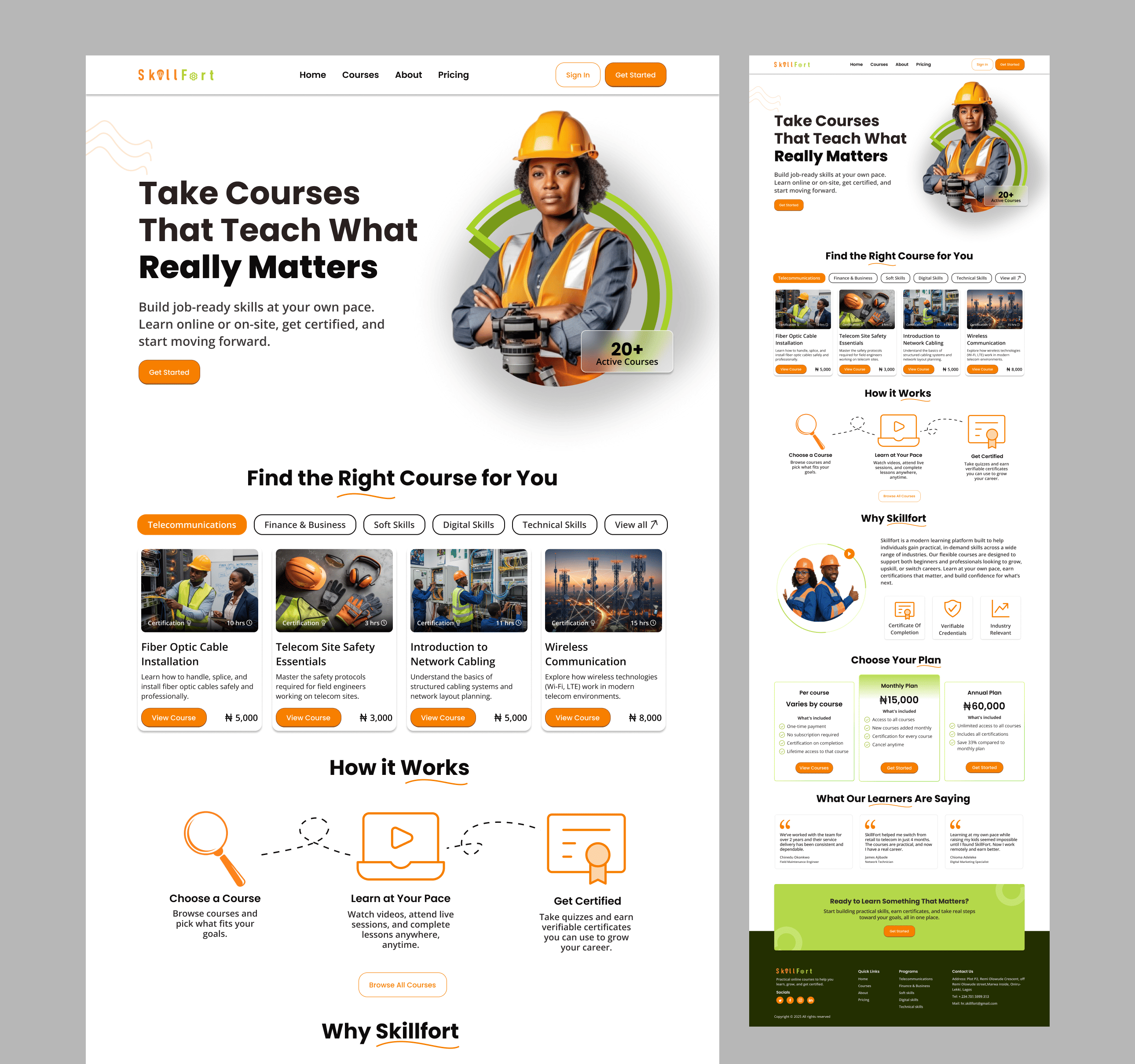
The hero section immediately anchors the platform with the bold headline “Take Courses That Teach What Really Matters” and direct supporting copy (“Build job-ready skills at your own pace. Learn online or on-site, get certified, and start moving forward.”). Paired with an authentic image of a technical/vocational professional, ambient curved brand accents, and a prominent “20+ Active Courses” trust badge, the hero establishes immediate credibility and provides a clear primary CTA (“Get Started”).
“Find the Right Course for You” — Category Tabs & Card Scannability
Directly below the hero, learners encounter the interactive course discovery module with category pill filters (Telecommunication, Network & Hardware, Soft Skills, Digital Skills, Technical Skills, More). Each course card features a real-world technical training thumbnail, category badge, course title (such as Fiber Optic Cable Installation, Telecom Site Safety Essentials, Network Cabling, Wireless Communication), duration/certification indicators, clear pricing (₦5,000), and a high-contrast “Enroll Now” CTA.
Structured 3-Step Process & Flexible Membership Pricing
To remove cognitive friction, the landing page guides learners through a simple 3-step pathway (1. Choose a Course → 2. Learn at Your Pace → 3. Get Certified) connected by an engaging visual dotted line. Below this, transparent pricing tiers (Pay As You Go, Monthly Plan at ₦15,000, and Annual Plan at ₦90,000) make subscription commitments clear with feature checklists and risk-free guarantees.
Design System & Accessibility
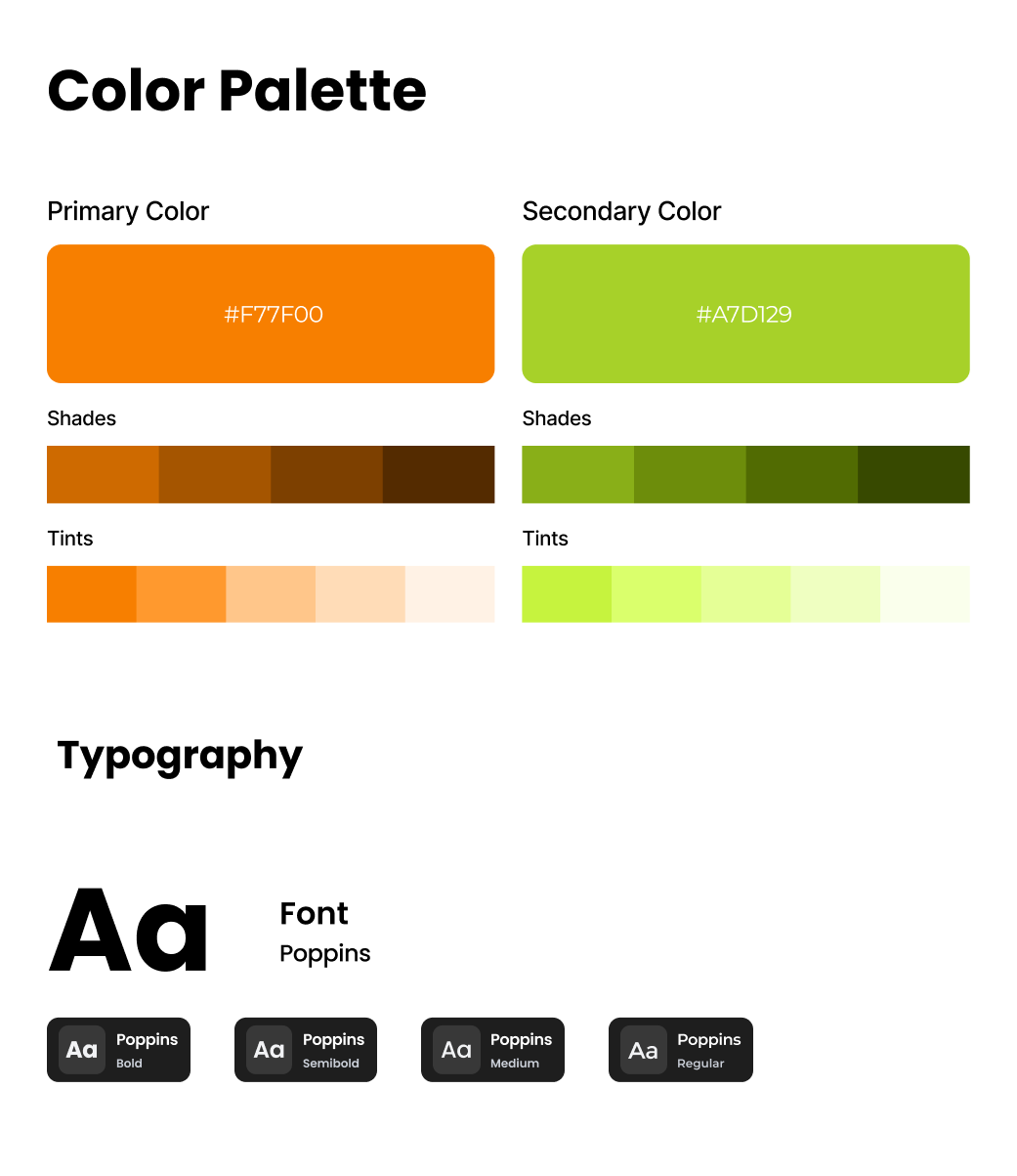
A modular, scalable component library was created in Figma using atomic design principles, ensuring seamless developer handoff and consistent accessibility.
Design Explorations & Landing Page Hierarchy
Before finalizing the visual balance for the SkillFort landing page, I explored different framing and layout iterations for the hero and core discovery modules. The goal was to ensure the hero captured immediate attention with authentic technical imagery while maintaining high readability for headlines, value propositions, and the course catalog.
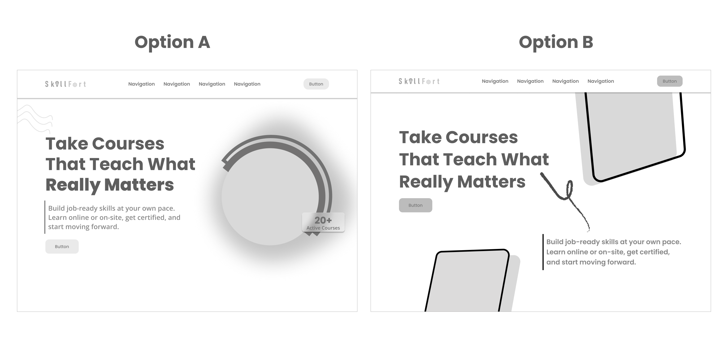
Hero Balance & Immediate Course Catalog
The final layout pairs the bold headline with a vibrant framed professional photo, organic wave motif, and the “20+ Active Courses” badge on the right. Directly below, learners can filter categories and view the top technical courses without scrolling through fluff.
- ✓ Clear Visual Hierarchy: High-contrast typography immediately communicates the core value: practical, job-ready skills.
- ✓ Frictionless Discovery: Placing category pills and course cards upfront allows users to browse and enroll immediately.
- ✓ High Trust & Relatability: Professional technical imagery resonates directly with students and vocational trainees.
Seamless Progression from Discovery to Enrollment
The full landing page is structured to progressively build learner confidence through every scroll depth:
- • Hero: “Take Courses That Teach What Really Matters” + “Get Started” CTA.
- • Course Grid: Telecommunication, Cabling, Site Safety, and Networking cards with ₦5,000 pricing.
- • How It Works & Why SkillFort: 3-step learning pathway and value guarantees.
- • Pricing & Testimonials: Transparent tiers (Pay As You Go, ₦15,000/mo, ₦90,000/yr) with real student feedback.
Final UI Design & Layout
The final UI delivers a modern, high-credibility digital experience. By combining purposeful whitespace, clear visual hierarchy, accessible contrast ratios, and structured curriculum previews, the interface eliminates uncertainty and positions SkillFort as a trusted, career-advancing platform.
Project Outcome & Impact
SkillFort serves as a prime demonstration of how rigorous UI/UX strategy transforms educational discovery. Beyond static interface mocks, implementing this platform as a responsive web app validated that the design decisions function seamlessly in real browser environments.
Targeted information architecture allows learners to find, evaluate, and preview their ideal course curriculum in under 3 minutes.
Tested across mobile (390px), tablet (768px), and ultra-wide desktop (1440px+) with zero layout breaks.
Passed color contrast and keyboard navigation audits, ensuring full inclusivity for all learner demographics.
Future Improvements
Key areas targeted for upcoming product iterations include:
- Interactive Skill Assessment Quiz: A 60-second questionnaire on the landing page recommending tailored career tracks to undecided learners.
- Live In-Browser Syllabus Previews: Expandable interactive modules directly on the landing page allowing students to view lesson videos without registration.
- Student Community & Project Showcase: A social proof gallery featuring live portfolio projects built by graduates of the courses.